My Role:
Consultant - Industry Design Project
Interaction Design & UI Lead
Tools Used:
Figma
Project Space:
Web
Enterprise
Edtech
UX Processes I Utilized:
Sitemap, User flows, Sketches, Styleguide, Hi Fidelity Mockups
This project was a collaboration between Springboard and Actionaly for an Industry Design Project. Actionaly is an Edtech enterprise company allowing users, usually teachers, to use an app to create documents which can then track parent responses. The need from the company was to assist in redesigning the admin panel, typically used by administrators. The request from the client was to develop a dashboard which could better show engagement and to launch a UX audit of the existing site.
While working on this project I operated under several constraints; the project was for a total of 40 hours, to use a material design format and testing users was not possible. While I would normally not jump into Hi Fidelity design after Sketching however since Material design assets are so mature I was confident that after transferring ownership of the figma file to the client the hi fidelity version would provide the most value.
As part of my project scope we agreed on several deliverables, to create a dashboard, redesign the 'Pods page' (list serve page) & Activity page(communication log).
See below for an example of Actionaly's existing site before changes were made

Crazy Eights
The client requested I take a 'blue sky' approach to the dashboard redesign, an exciting opportunity but also a challenge with so many options to display data. The only existing tracking data used was the number of responses to document requests.
My first action was to write down the 'pieces' to work with; who was involved, teachers, parents, administrators and what actions could be tracked such as, logging on, responding to messages, etc.
Once this exercise was completed I moved onto ideation using the 'crazy 8s' tool to draw 8 potential dashboard ideas in eight minutes.
The result narrowed down several potential options which would end up in the hi fidelity product: cards to store existing information and give visual weight to valuable metrics, bar charts to show usability, and circular progress bars which would be able to show the percentage of responses while taking up less space than a bar chart.


This project included work with two other designers who were working on the app portion. To help them with their UI designs and ensure consistency across product features the Styleguide was created.
Actionaly already has a branding and design guide, with 14 different color options so I used their existing color scheme to inform color choices. In selecting colors I used different hues to ensure consistency. The exception to this was using the bright green color which is used to convey positive feedback to the user.
The Typography options were also based off of the original design with headlines generally being 18 font medium and the standard portion of the copy being 16. Using Material Design, Roboto was used as it was in the original.
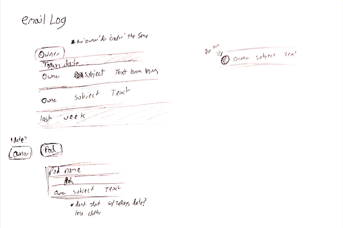
After the crazy eights exercise I continued to sketch potential solutions to the dashboard issue. Seen in the top right you can see the content that would go into the final design (next screen). This also allowed me the opportunity to work through how to show different types of data, whether to use a button or other selection control.
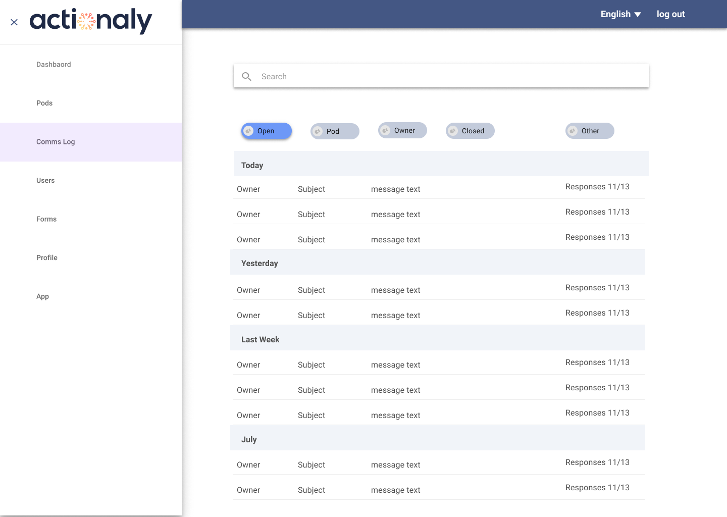
For remaking the 'Activities page' which would eventually become the 'comms log' I used the sketches on the bottom right to experiment with different hierarchy and filter options.
While I use sketches as part of my UX process I also utilize them when confronted with a block on how to visually show data.

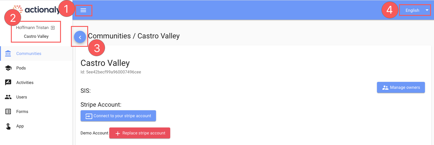
Changes from Original
1) Hamburger Menu changed to exit button when dashboard is open and left in the same position to ensure a consistent experiance for the user.
2) Next to the name is actually a logout button, this was moved to position 4, since this corresponds with common logout placement for existing websites. The user name was also removed, with user information being moved to the profile section since it is taking up a significant amount of space for no benefit.
3) This is a back button which is unnecessary for a desktop screen where the browser back button works just as effectively.
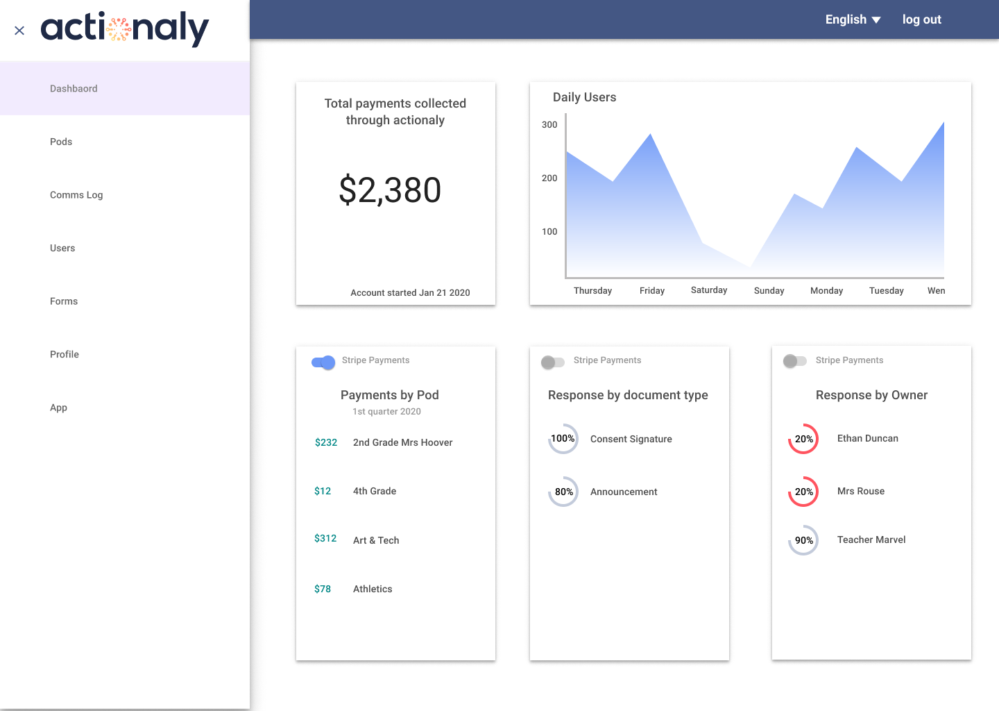
Dashboard Breakdown
Rather than use filters I decided to include three response metrics which could also be transformed into revenue numbers using a selection control. Finally a graph was added for daily users from the product, a good base measure for usability. Adding strong visual weight to collected payments highlighted the companies value proposition, also the original ribbon color did not meet accessibility guidelines so was changed to a navy blue.
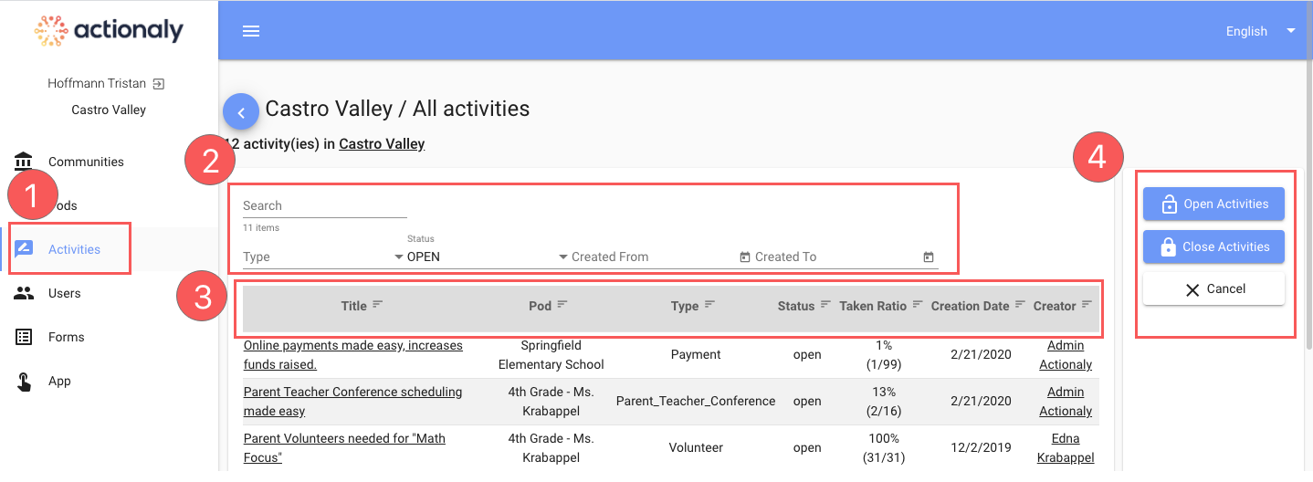
Changes from Original
1) The activities page is actually a communication records log and so was changed to comms log to be more descriptive.
2) There are several menus on this page, I broke this down to one search bar and gave it more weight while the drop downs were converted into a button filter.
3) Knowing that the intention of this page is for communication I broke down information along email applications. Also, the amount of information was pared down, responses were kept but the primary information is sorted automatically by date and becomes a secondary hierarchy when sorted by other features.
4) Switching to open and closed activities, was moved from the right where it is outside of users primary visual range to being part of the filter buttons.
Filter choices
To simplify the number of options chips are used as preset filter options with the original button moved from the far right to top left where users naturally look. For the Other filter, I used this as an opportunity to speak with the client about their needs and to highlight the opportunity of speaking to users about what collection of data types they typically search for.
Once an individual activity/log is select the user is brought to a second level where they can view who has replied, download information from an internal school server, print forms and generate reports. To help the user achieve their goal, information that previously resided in multiple sections was brought into one page while simplifying the density of information for users.

While presenting to the C level group and staff it was brought up that replies can often exceed hundreds or even thousands of replies and I was asked how the new design would address this. My response was that a small search bar above the replies could be added along with a scroll feature so users could find a needed individual.

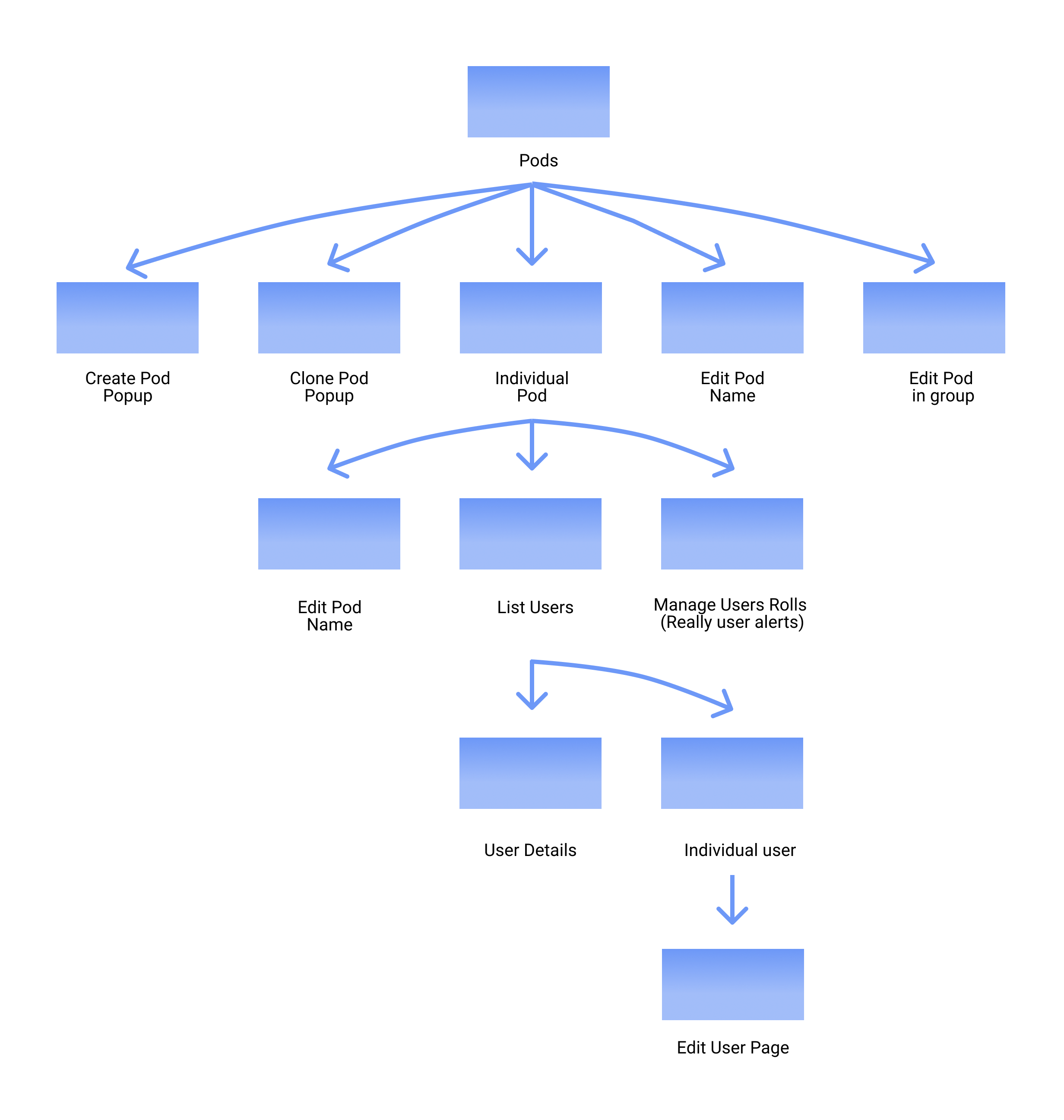
Understanding the existing Pods file was complicated, there are two levels of user permissions in the system, alerts based on communication and user form permissions. After speaking with the client we discussed drafting some solutions using information architecture to rationalize the existing UX.
After reviewing the existing site and listing feature requirements. I proposed two solutions, keep the information on one page (picture below right) or using progressive disclosure where the client receives a number of popups to fill in the new pod information (not shown).
After speaking with he client about options we agreed that using a single page would make the most sense, it also allows them to make a copy or 'clone' of existing pods. This also brought up a new feature not included to combine multiple pods into a single grouping.
This feedback resulted in adding a 'form type' option to be added as well as changing the edit pod button to a 'clone pod' or a copy and combine button which would allow for creating multiple pod listserves.

The final act to support the client was transitioning the figma file to an in-house employee and hosting a webinar to review and justify design decisions and recommend next steps. For next steps I reiterated the importance of user testing while pointing out why design choices needed to be validated by users. During this time I also gave examples of questions to ask and features which could especially use user feedback. Before launching any new designs however I stressed the importance of deciding what features each enterprise plan would have and how to visually lay them out including the forms page which changes based on what type of plan is held, a business redesign that they are currently working on. What I personally gained was confidence in applying material design for UI projects and in being able to articulate UX needs in a formal setting.