Project Details
My Role:
Sponsor, Product Designer, UX Designer
Tools Used:
Figma
Project Space:
Web
UX Processes Utilized:
Mood board, Logo Design, Sketches, Style guide, Interview team lead, High Fidelity Mockups
Logo Moodboard
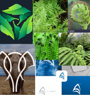
I came to UX Design from the project management field so it was a privilege to be able to create a logofrom scratch. Taking the mood board from the left I began to scetch over different plants and continued interating util the below results were reached
Results


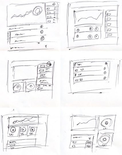
Sketches
Sketching is an iterative process for me and one I often return to when confronted with new issues in a project. Here sketching took the place of low fidelity design since I felt comfortable enough to jump to more detailed figma artboards.
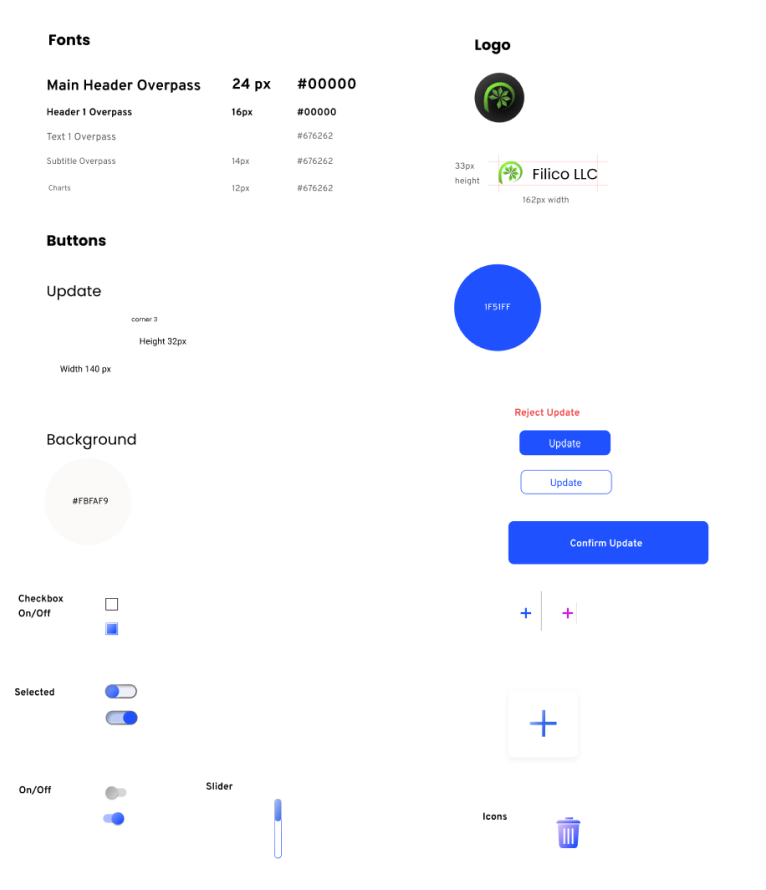
Styleguide
Color styles were decided to be an “on white” style with call to action colorbeing 1F51FF. Additionally this color was used to signify to users that an asset may be interacted with.
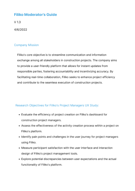
Design Brief
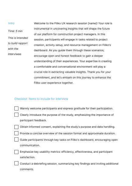
Before hiring developers I sought out a Jr UX designer to conducted user interviews. I provided them with a script and coached them through several mock interview sessions.
Hi Fidelity Updates
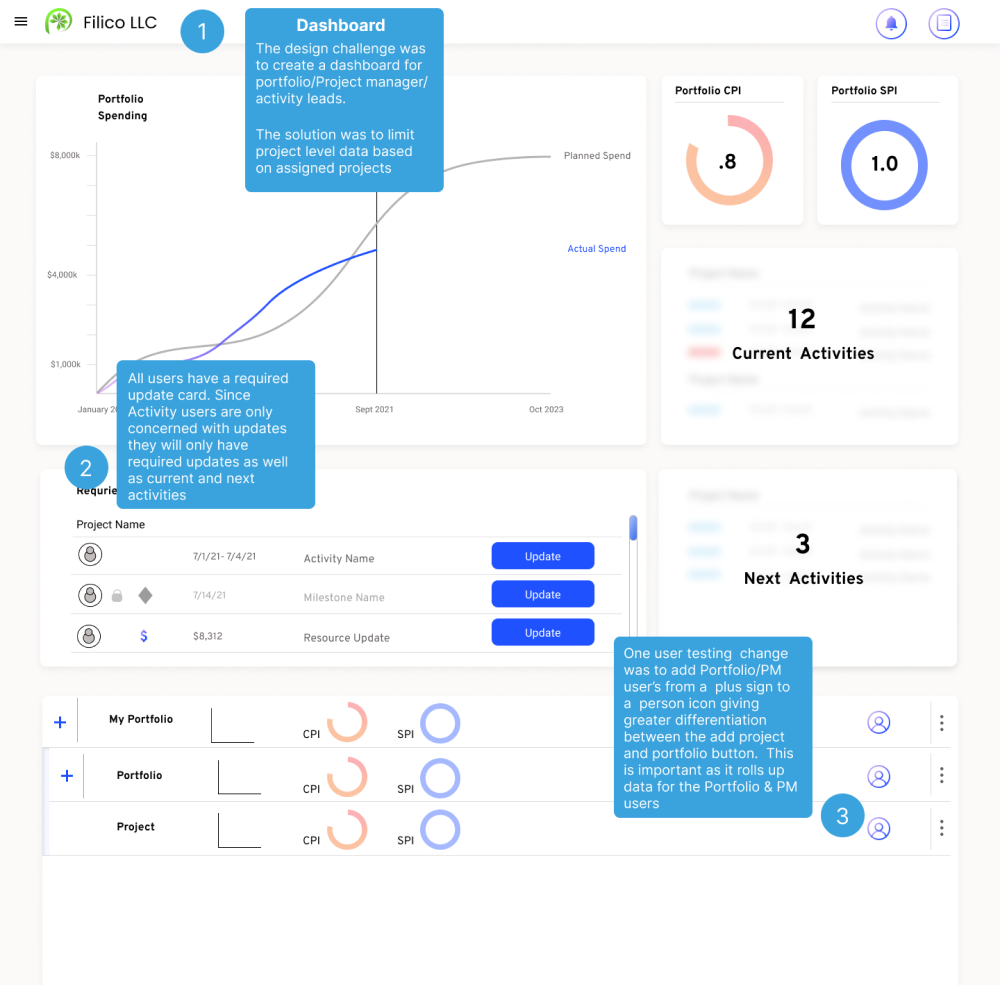
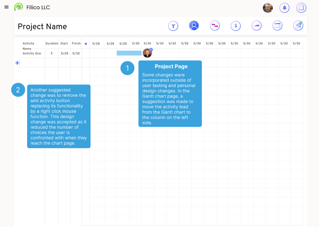
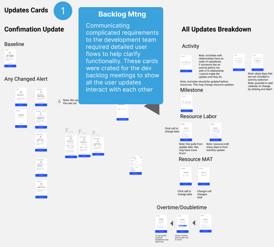
See below for the final results and changes that were made after testing and working with developers;
Conclusion
Taking my enterprise project from concept to development involved adeptly managing a team that included a junior UX designer and an outsourced development team. Balancing the creative input of the UX designer with the technical execution of the development team required constant communication and adaptability. This experience emphasized the importance of collaboration, recognizing individual strengths, and adapting leadership approaches. The lessons learned in this process will undoubtedly contribute to the ongoing success of the project and inform future ventures.