My Role:
Student
UI/UX Designer
Tools Used:
Sketch
Project Space:
iOS/Android
UX Processes I Utilized:
Google Ventures Sprint, Sketch User journey for competitor sites, Crazy 8s, sketch proposed red route, Low fidelity mockup
Sprint Day 1
This project is was given by Springboard with the main goal being to learn the agile design sprint process. Research about the fictitious company “Post Up” was provided by BitesizeUX which included a recorded user interview, research and Persona to build off of.

Post up is a company that connects remote and freelance workers to the best cafes and coworking spaces tailored to their needs, it is based on a subscription model so the companies goal is tailored to that of the user.
For the first day of the sprint, I sketched out several potential user flows. For the first example, I knew that I wanted users to place their preferences during the onboarding setup. Since users discussed having to spend large amounts of time on sites to see if a cafe meets their requirements, this would ensure that the user goal could be achieved in a short amount of time as possible. The second sketch was focused on bringing the user to the search page as quickly as possible. While this had the benefit of being quick based on the wide range of users needs I decided to go with the first option so the user would have relevant searches.
Sprint Day 2
In the second part of the sprint, I sketched out the primary user journey of competitors such as Yelp, Google Maps, and Trip Advisor.
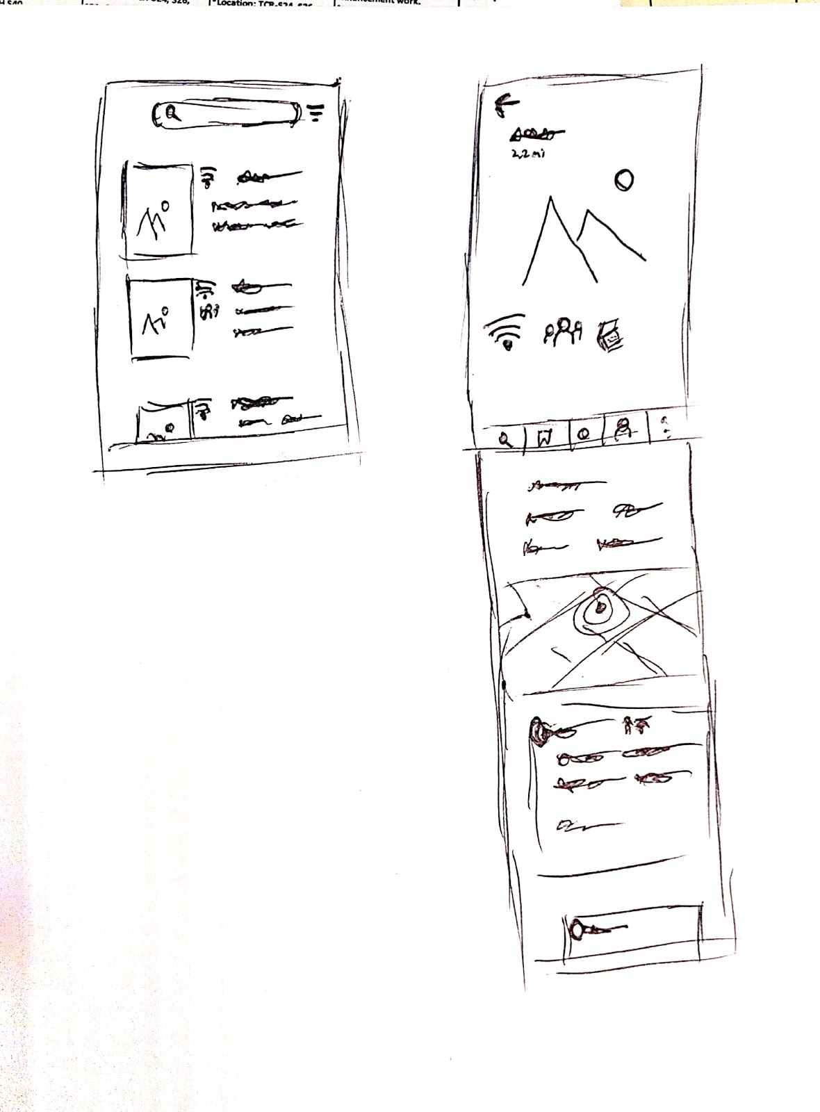
Included in the second day of the sprit was a “Crazy 8s” sketching 8 solutions, seen in the bottom left. From there I decided to augment the last solutions where the cafe/coworking description contains a picture and icons as part of the screen showing what the facility specializes in.

Once the design was selected I sketched the primary screen and the previous screen that users would come from, seen in the picture on the bottom right. This contains a layout of the search function and the primary site as well as additional information on the scroll down.


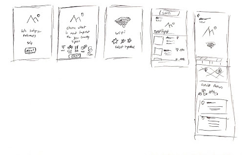
For the third day of the sprint 5 pannels were created to represent the primary user journey - choosing their primary preferences (based on the research provided). The first panel gives users the option to complete the onboarding or to go directly to the search tab. While creating preferences users can wight the importance (panel 3) for example how important wifi is. From there users are directed to the search bar where, to reduce cognitive load, the best option is provided on the top of the screen while additional options can be seen below.
The final screen has the map being seen on the bottom of the screen as a subtle hit for users to scroll down to see more information.

Sprint Day 4
The Low fidelity mockup was created in Sketch, during the design I sought to make good use of white space. Icons were added to the search bar so users could view what are the top amenities of the spaces that they re looking for.

Sprint Day 5
User interviews focused on young urban professionals around 30 years old who have disposable income.

Time on Task is the average amount of time it took users to achieve their goal.

Ideally, it should take only 9 actions to achieve the user goal. The average user we tested with required nearly 11. While this score was quite good the errors mainly around choosing icons.

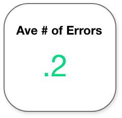
Average number of errors refers to total errors per each action. This was calculated by the number of errors divided by the total minimum number of actions.

When completing the interview I requested users answer a quick questionnaire about their experiences. Asking to rate their experience out of a 5 point scale (5 being highest) three questions were asked; Rate the ease of use, perceived time to achieve their goal and the total satisfaction with the experience.