My Role:
Consultant - Industry Design Project
Interaction Design & UI Lead
Tools Used:
Figma
Project Space:
Web
Enterprise
Edtech
UX Processes I Utilized:
Sitemap, User flows, Sketches, Styleguide, Hi Fidelity Mockups
Problem Space
1.7 billion people on our planet don’t have access to a bank account while businesses and individuals struggle to obtain capital or credit. In short people and businesses in poorer countries want stuff but they can’t get the financing for it. This project seeks to remove friction for businesses and countries without easy access to money.
Why Underserved Markets
This topic is important to me. During my early career, I had the opportunity to work as a Peace Corps Volunteer in Tanzania and afterwards with the Microfinance group FINCA. The vast majority of the population there lives on less that $2.50 a day and money lenders charge exorbitant rates, it is clear from this experiance that people need greater access to credit.
Secondary Research
My research confirmed that yes, countries with sophisticated financial systems and stock markets tend to grow faster and be more productive. In addition there are other types of ‘social financing’ operated by islamic banks that use innovative lending methods without charging interest.


The Primary research interviews consisted of interviews with expats living within the US. The respondents were from a range of countries including Peru, Colombia, Morocco, Nigeria, Sierra Leone, and Kenya. Each respondent reported that they invest money within the United States but 33% of respondents didn’t invest in their home countries. Everyone pointing out the high barriers to getting loans from banks as they often require high collateral and interest. Most interesting was that every single response mentioned trust, lack of trust both in individuals and banking institutions, as the single biggest issue in investing overseas.
Bottom-up Financing
Without formal institutions, people take financial matters into their own hands.
What bottom-up financial system does Morocco, Colombia and Nigeria all have in common? Its a group savings account, where you and a group of friends will pull your money together, and then a (usually) randomly chosen person will receive the full amount to make a large purchase.
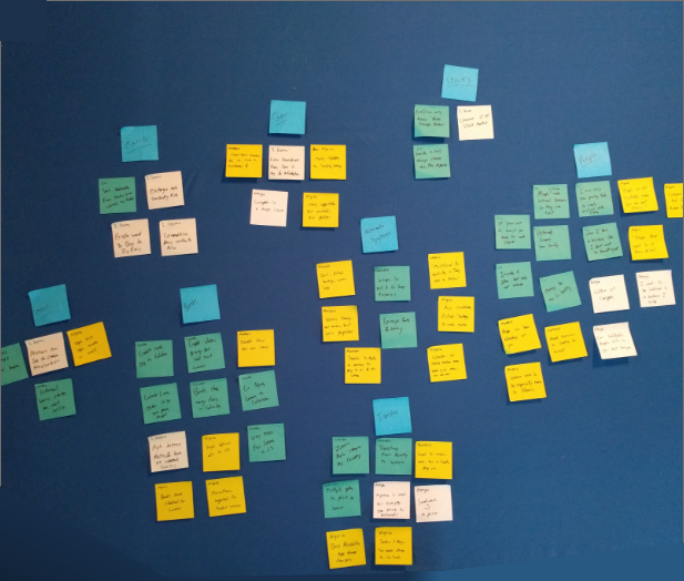
Taking notes on color-coded postes based on what region interviewees were from, I began to look for common responses and then compile those into topics. With most comments centered around people then followed by banks and alternate financial systems. Based on the survey responses I centered my questions around existing answers and since each of our respondents answered that trust is the critical issue.
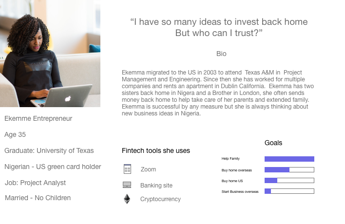
Other Analyses conducted included “As a user I want” statements, a technique to build empathy with users and generate insights into what features might be needed to achieve a minimal viable product. Without access to a white board I had to be creative about where to layout my data.


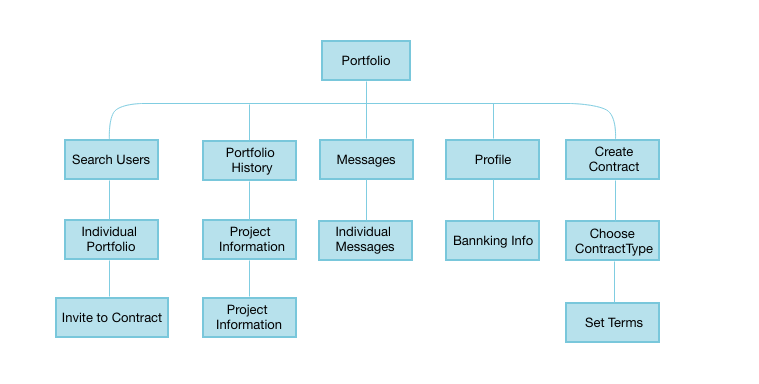
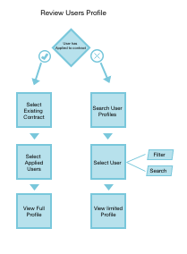
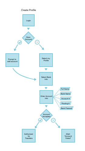
As will be seen in the high fidelity mockup section, I use sketching as part of the prototype test iterate process and would return to them often to prompt new creative options when I would become stuck. These stages walk through the user search format, to visualize what requirements would be needed for the low fidelity version.

To the right are the original sketches on flashcards. Using physical artboards to visually show a hierarchy of different options. It contains the profile creation (top right), search bar bottom left, and details for how to create a contract.
Having these options laid out allowed a different perspective on what new frames need to be created.

Using the Create a contract example above I had realized that I was using up too much of my user’s cognitive load - by having as can been seen the CTA shading emphasis changes rests on my account and publish, while that action we want the user to take to create a contract is a separate button.
While looking at the High fidelity style guide on the next sheet below observe the changes to reduce the number of buttons and settings for our users.


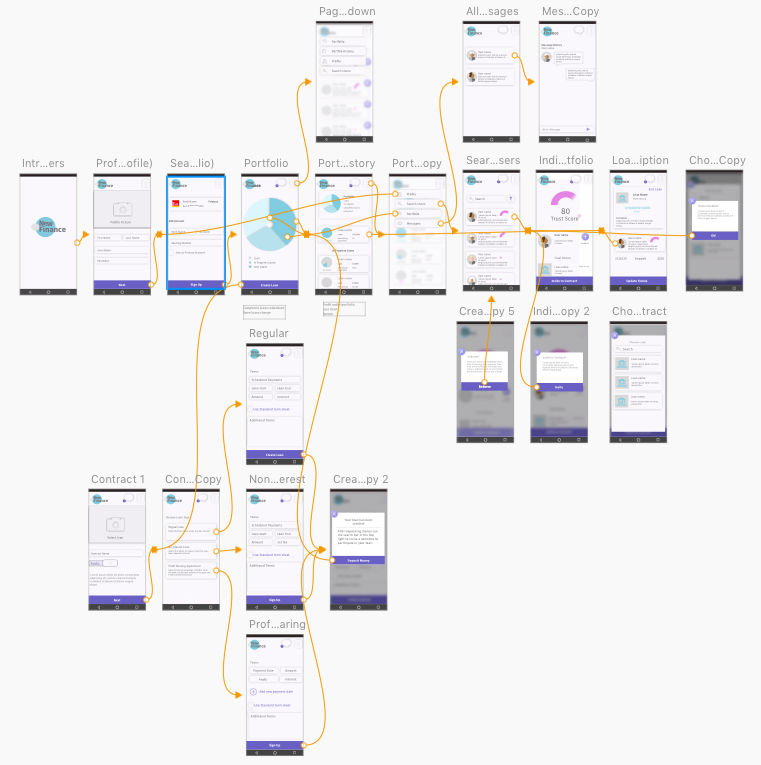
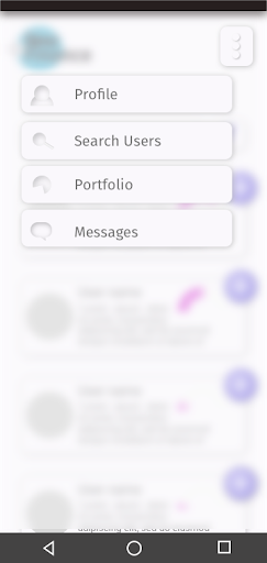
The high fidelity mockup below is a result of the accessibility audit, developing new ideas when creating animations through Principle, and iterating based on user feedback. The changes from the low fidelity mockup, such as adding more white space and changing from tab bar to a dropdown menu were dictated by deciding to go with a partial skeuomorphic design.
To ensure that this product would be accessible to the widest number of people I researched how to view Sketch art boards without saturation.
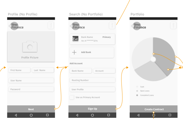
Additionally colors were checked against the background and the results showed that the text and call to action colors were providing a barrier to our user. So the colors were darkened for greater contrast.
Text on Background 2.73 - poor
Result: New text #737373
CTA white on Purple 2.56 - Poor
Result: New Purple CTA #6A5FC5


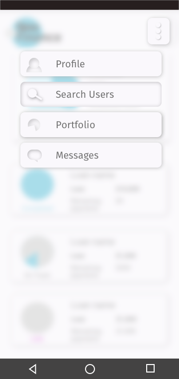
Using animation let me take the designs in new directions. With principle I staggered the entry of the menu bars and added seamless integration by having the call to the action bar, pie charts, and the user trust graphic merge into new artboards.
Thinking in terms of interactions led me to change the in progress state by indenting out the icons.
The video below shows the smooth transitions using principle. Notice the delay when the dropdown menu is brought up to give it a wave look as well as the transitions with the pie chart and half-circle trust bar traveling from frame to frame.
Testing was conducted by selecting 5 users based on their professional status if they have family or loved ones overseas. The goal of this test was to see if users were able to successfully complete their user goal and to provide feedback to iterate on new designs.
The test was divided into four user goals:
1 how to create a profile
2. Create a Loan
3. Invite a user to your loan
4 Find the loan once you have created it.
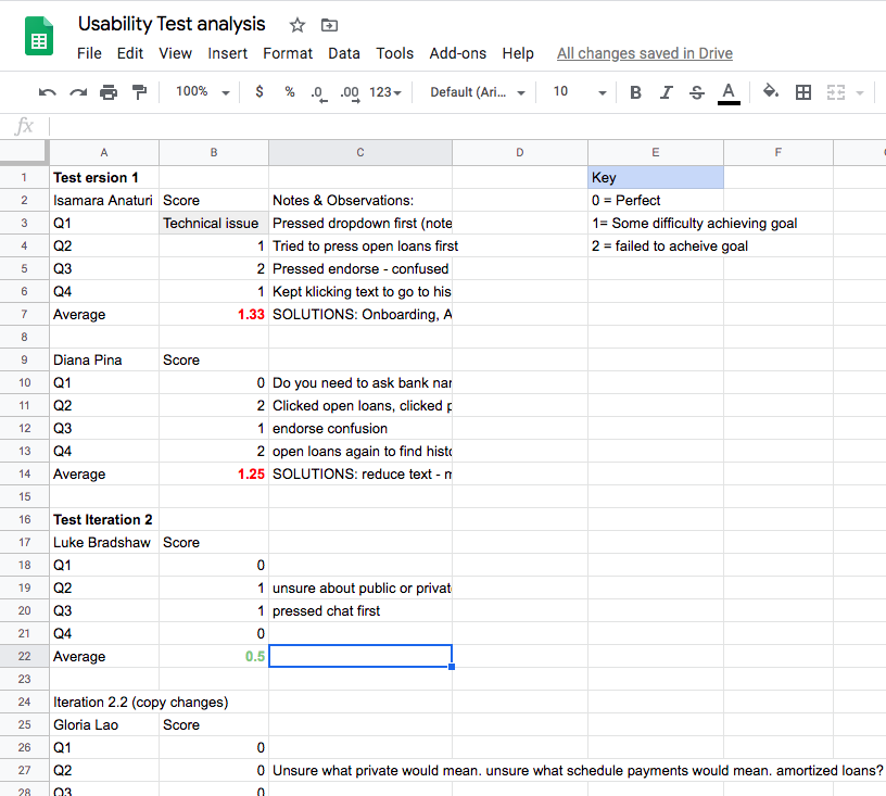
Collecting and Analyzing data
To the right is the results from the five-person user test analysis. The data was based on a simple scoring format that gives a user a 0 if they are able to successfully complete their given user goal. 1 if they have trouble achieving that goal and a 2 if they are unable to accomplish their goal.
This scoring system was chosen as it is focused on usability and directly addresses this usability testing’s goal of checking usability.
The first version had users making consistent errors. The first with a search art-board having the call to action color being applied too liberally while the second issue revolved around UX Copy which did not always concisely and clearly describe what the user’s goal was.
CTA Major Change: Adding an endorse button on the user card under the search user’s path was a recurring issue in our V1 tests. Using a call to action color the user either tried to open the card by pressing the button or were left confused as to what its purpose was.
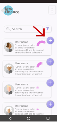
Copy changes to open loans: Open loans were changed to current loans and the spacing was pulled in together in an effort to ensure that the user associated the text with the above pie chart. This had the desired impact of reducing errors.

Strategic Changes: During the V1 interviews, I had an unfortunate realization. In designing my MVP I had minimized too many of my core features. The New Finance Networks goal was to provide an investment vehicle for ex-pats and to create trustworthy links for its users. To address this issue I made the decision to add additional lending options so users could experiment with different types of finance.
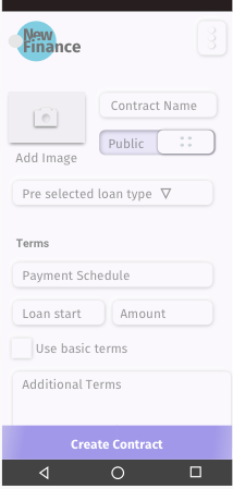
To the right is the original concept for the loan creation page. The copy was changed from create contract to create loan. While “Create Contract” supports the mission description to provide different types of customizable financing options it also provided a point of confusion when user testing was made. So the copy was changed to “Create Loan”
The amount of information on this original option was also dense and conflicted with the open aesthetic that the other app contained that used a large amount of white space.
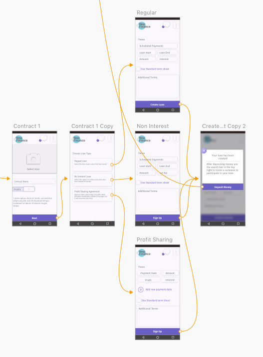
Changes made allowed for three general types of loans, to more clearly articulate New Finance’s mission. Users responded positively to the changes, while the user was not always clear on what something like a profit sharing agreement would entail. They all were able to correctly select the regular loan option to complete their goal of creating a 1000 loan at 4% interest.
Lessons Learned
Users were enthusiastic about the concept, and design. I was worried that using buttons and cards made out of drop shadows would prove to be an issue that prevents users from achieving their goal but the user interviews showed this not to be the case.
Things I would have done differently would be to include tracking success rate and the time on task, as well as tracking the number of errors. This would give a better visual representation between my user tests and tests for future iterations. Finally a quick satisfaction quiz could be added at the end of the test. These measures would provide hard data on the improvements that I was able to accomplish. And should projects be implemented show stakeholder how UX is improving the product and field.
While completed for a bootcamp, the feedback from my users suggest that a project like this would be viable as a way to help those in developing countries have access to capital.