My Role:
Student
UI/UX Designer
Tools Used:
Adobe XD
Figma
Otter.ai
Project Space:
Web
UX Processes I Utilized:
Competition analysis, styleguide, User flow, low & High Fidelity mockups, User Testing

Project
This was a Springboard Class project to simulate a real-world eCommerce project. The notes below were given from the ‘client’ which suggested that their firm was having conversion issues through checkout and with users dropping out after viewing 7 item pages.
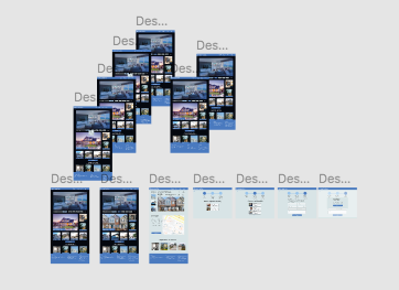
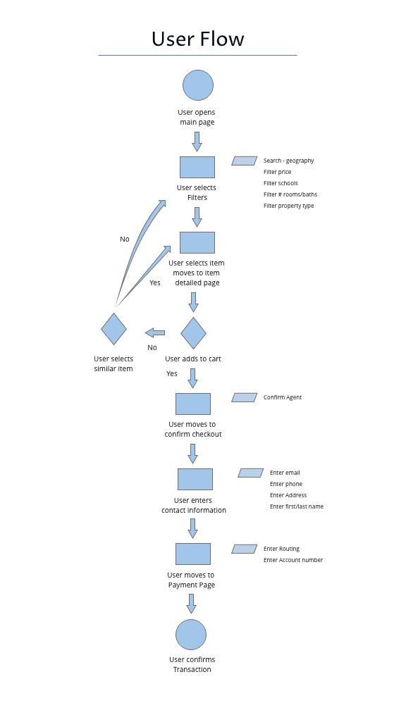
In addition to notes from the client included, a low fidelity mockup was provided showing how a typical user would complete their checkout goal (see below). This class project includes research in the Product space, Styleguide, new user flow path creating low fidelity mockups which are then followed a usability test by 5 users which informed the High fidelity version than a final iteration based on an addition 5 person user test.

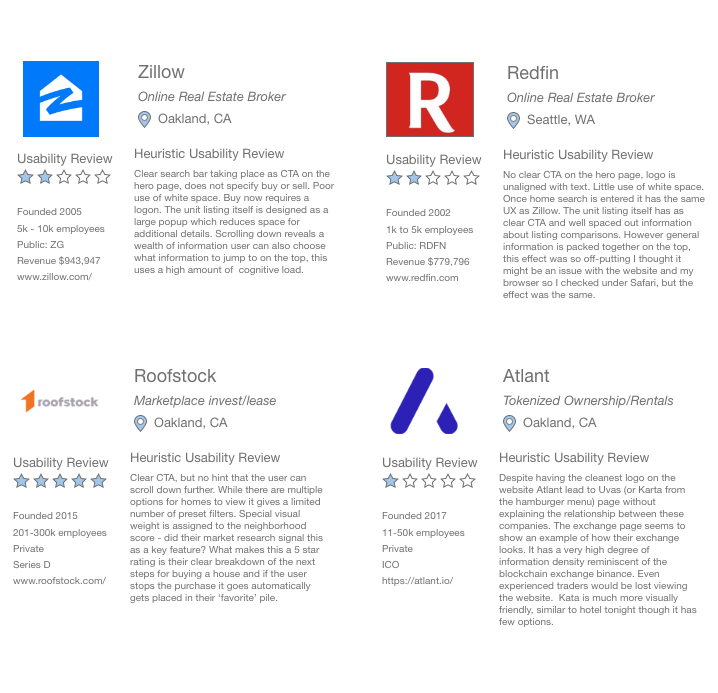
The research was based around a competitive analysis of companies within the same space of homestead at which point a heuristic evaluation was given of what competitor’s user flows are (below) Followed by a competitive analysis of the competitor’s size, revenue, and funding stage as seen on the next page.
The drop off of conversion rates after viewing 7 items implied that our users were unable to find items that they wanted. The solution I chose to address this conversion issue was to and a search feature and detailed filter laying out the most common filter options. Seen as buttons to the right of the search bar.
When showing items to reduce cognitive and choice overload I gave greater visual weight to a specific product. Seen as the large box below the search function.
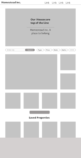
To the right is the product page. This page works to solve the drop out issue by showing similar homes listing as well as popular homes on the bottom of the page.
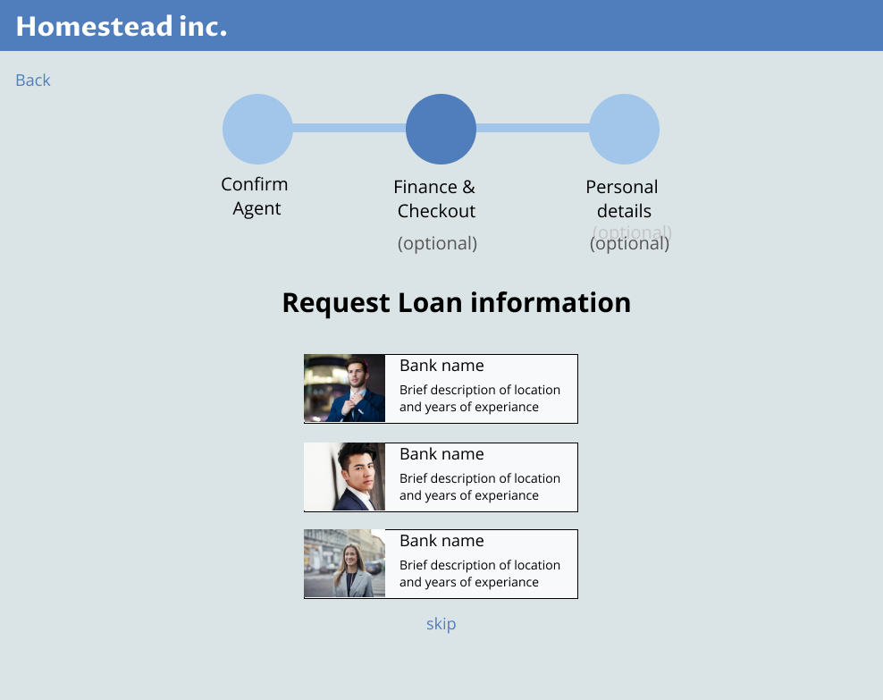
To solve the dropout issue (example on page 10) I chose to show feedback to users for where they were in the checkout process and how many steps remained, giving feedback for where they were in the process and providing feedback for how much of the checkout process the user accomplished.

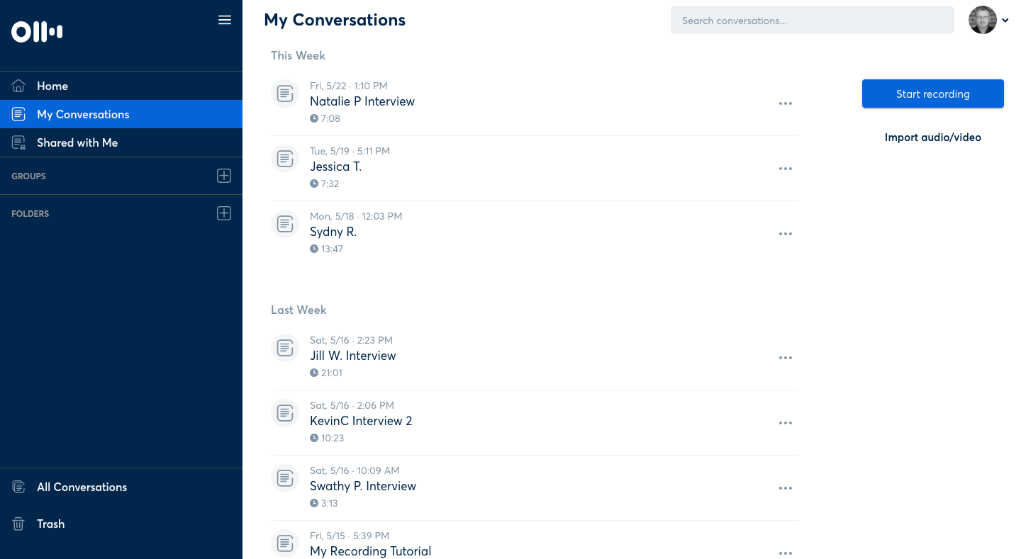
The first round of usability testing was conducted using otter.ai a recording/transcribing site and was measured on 3 point scale. The scale was based on whether the user achieved their user goal, despite straying from the user path or failed to achieve their goal. Interviews were conducted remotely and users were able to reach their goals successfully. The feedback from these testing sessions that was most helpful was on the content Copy, aside from catching several typos users revealed that the descriptions of the checkout process would need to be rewritten as users were confused about whether they were requesting a home viewing or actually purchasing a unit.
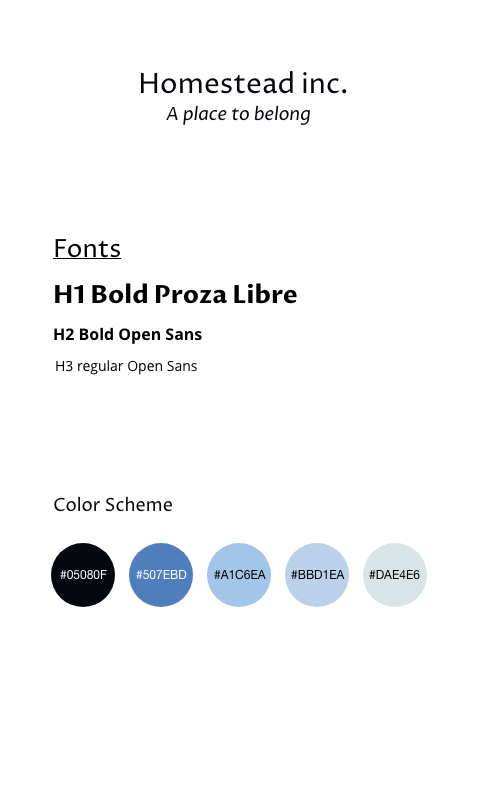
While the color scheme of blues and dark colors was an early on to convey a sense of professionalism with a relaxed atmosphere as the user moves through the real estate process. The choice for the black background was not made until I began to play around with the primary color options and the black backgrounded provided a striking contrast to the chosen pictures.
The other change from the low fidelity version was to add a brief description with the price and number of bedrooms and bathrooms. Since the users currently look and up to 7 products before failing to convert. This allows an easy way for a user to define their preferred choices.
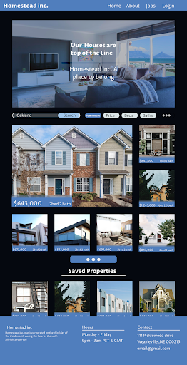
There were few changes from the first and second usability test with users able to complete their goals with ease. One change was as on the visual weight to the checkout process, the interviewee was confused by what the ‘ask’ was of the specific checkout page. Other feedback was to include a checkout confirmation to clarify that their request for more information from a real estate agent or bank lender was conveyed.
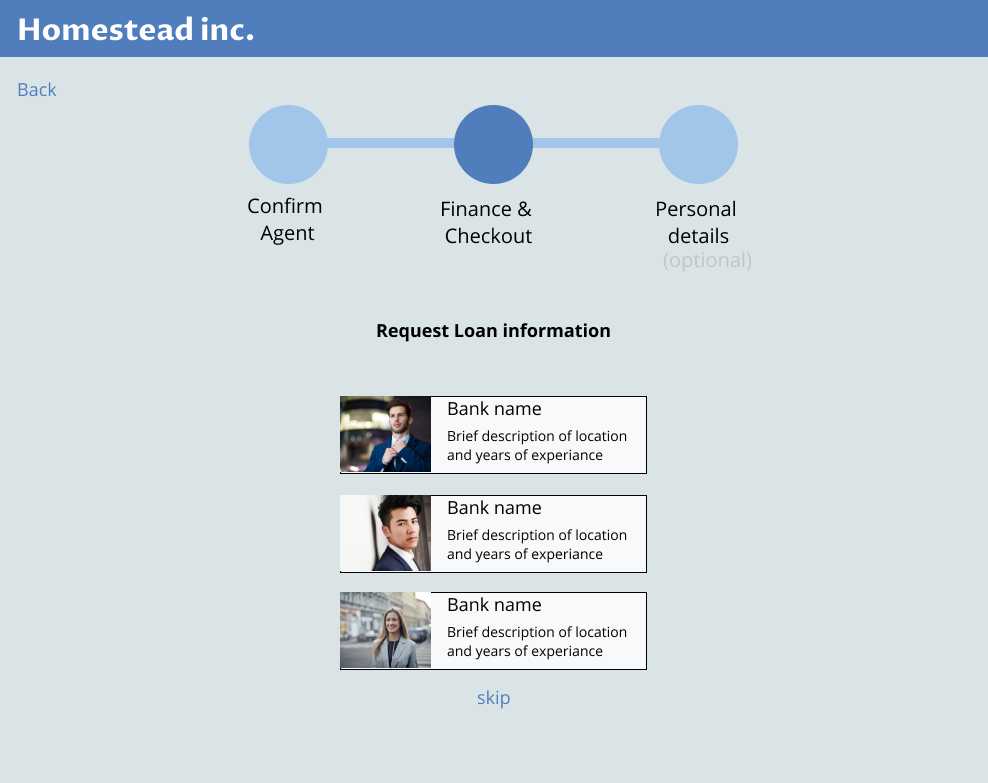
Checkout the final version on Figma
