My Role:
Sponsor
Product Designer
UX Designer
Tools Used:
Figma, Slack, Upwork, Midjouney, Click Up
Project Space:
iOS, Play Store
UX Processes Utilized:
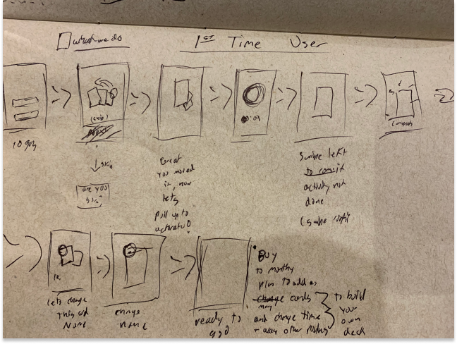
Concept Board, Sketches, User flows, Low/High Fidelity mockups, Scrum Task Managment


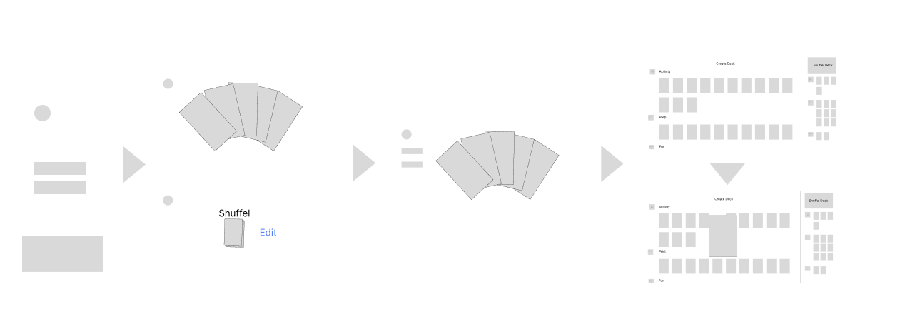
I made the decision to breakdown this productivity app into three sections. Activity, Prep and fun. Functionally only the prep activities have unique text, since they represent proven methods to increase focus. The activity and fun cards will edited by each user. Every card is functionally the same for user interactions, allowing for personalization of the title, timer and description text.


The high-fidelity UX designs focus on simplicity and beauty. Simplicity streamlines the user experience, emphasizing essential features for a functional MVP. Beauty engages users through fun, bright, and positive design choices, creating an inviting and enjoyable interaction. This balance ensures a design that is both efficient and captivating.


When the Flutter developer raised the issue that the cards wouldn't fit on small smartphones, I devised three potential solutions. First, we considered using larger card sizes that would stack vertically to fit the screen. Second, we explored implementing a list view for a more streamlined, vertical presentation. Third, we looked into dividing the card list and my desk into two separate pages, ensuring each element has ample space. These solutions will be discussed collaboratively to determine the best approach for optimizing the user experience on small devices.
Pawsitively Productive was a passion project aimed at helping individuals with ADHD, where I had the opportunity to create beautiful artwork using MidJourney. My role began with UX design and later shifted to product management. I found an excellent Flutter developer, and together we collaborated to refine and bring the designs to life.