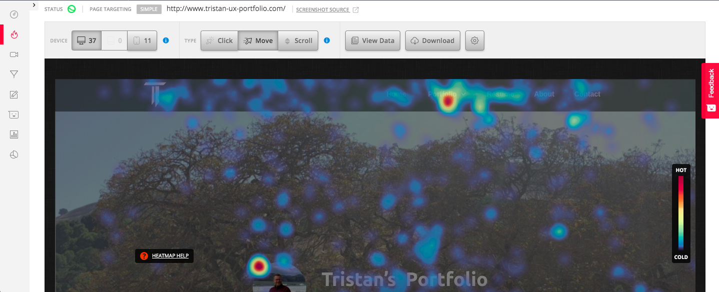
A Heatmap shows where people spend time on pages. By being able to view where my users move their cursor I can see what my users are looking at and what areas of my site they are not interested in. While viewing clicks will show interest and if there is an item which users believe should be interactive.
The heatmap is in progress and will need 1,000 views to complete. When I have this data I can review where most users are going in the site which will will allow me to optimize sections that users are observing and to choose new ways to highlight or cull sections that are not drawing interest. One initial change I made was having my picture transition to my bio page when clicked on.

It was with pure horror I watched the cursors of my users navigate this very portfolio with its (then) terribly un responsive design. Text and images in different sections bled into each other and I realized I would need some dev support to fix my lacking (but heroic!) coding efforts.
Reviewing the recordings showed me the need to address this fundamental product issue which was holding my portfolio back. Future recordings will allow me to see how an individual user interacts with my portfolio and which specific section they focus on as well as those points where they get bored and leave the site.

When you seek to leave this website a popup will appear at the bottom asking you to rate my portfolio. This measure is called a net promoter score (NPS) and it is used to measure customer experience and the number of Promoters a product has. By using polls I am also hoping that experienced UXers will provide specific feedback allowing me to improve the site. The NPS will also give me a number value to show how well my portfolio is representing my wider UX experiance and will eventually give a tangible ranking of my own value.